Does the problem matter enough?
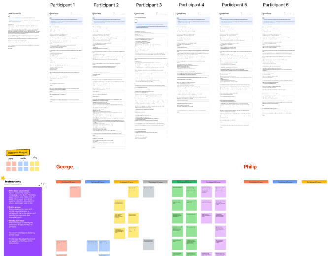
We aimed to confirm the significance of the problem we were addressing, so we interviewed 6 individuals to discuss their financial management challenges, their current approaches to tackling them, and their ideal solutions.
Upon analyzing the gathered data, it became evident that all participants encountered similar issues. This finding provided a clear answer to our initial question regarding the significance of the problem we were tackling. As a result, we successfully identified our ultimate user (persona).
Enter the UI.
(My favorite part)
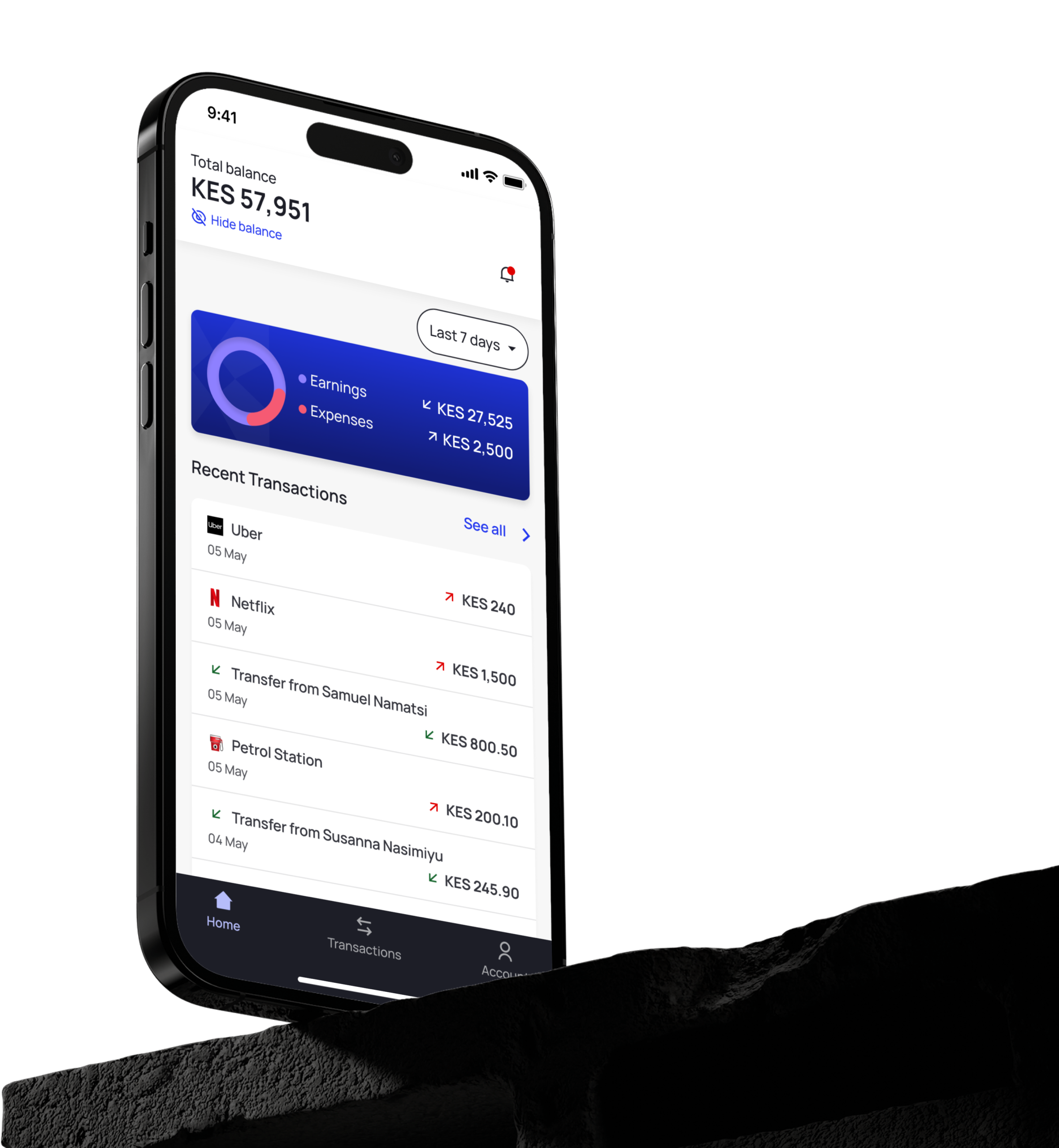
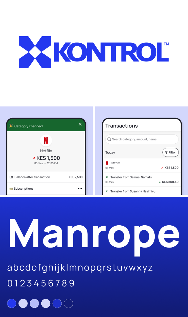
As this is a finance app, I opted for a simple and clean UI design to instill a sense of trustworthiness among our users. I believe we successfully achieved that goal.
Based on the interviews, we learned that some participants found previous solutions, like Excel sheets, to be tedious. To tackle this challenge, we placed a high emphasis on creating an exceptionally user-friendly app. I achieved this by incorporating familiar and intuitive UI & UX patterns throughout the entire application. For instance, I carefully selected appropriate selection controls, utilized suitable keyboards for input fields, and implemented familiar interactive patterns.
It’s all about connections.
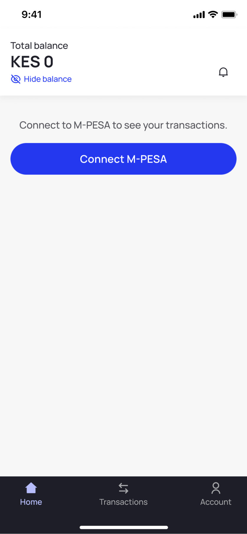
Initially, our intention was to enable users connect both their bank accounts and mobile money accounts within the app. However, we encountered certain limitations or constraints that prevented us from pursuing this approach.
Considering that a significant number of individuals rely on mobile money for their everyday transactions, we made the decision to prioritize its integration into the app first. Subsequently, we will tackle the task of incorporating card and bank transactions.
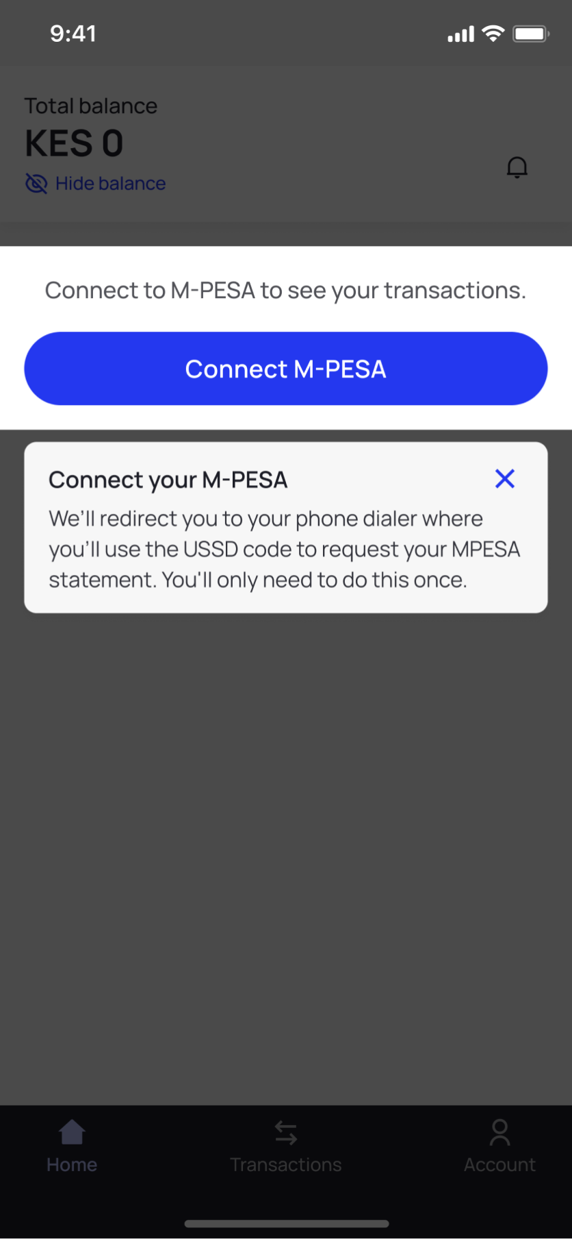
Show me the money.
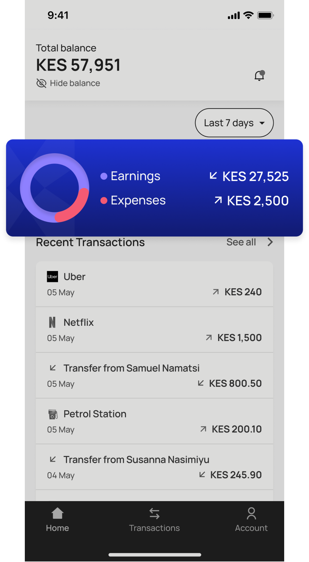
Once the user connects their mobile money account to the Kontrol app, the system is able to retrieve and display their transactions. Moreover, it provides the functionality to calculate and display the total earnings and expenses over specific time periods.
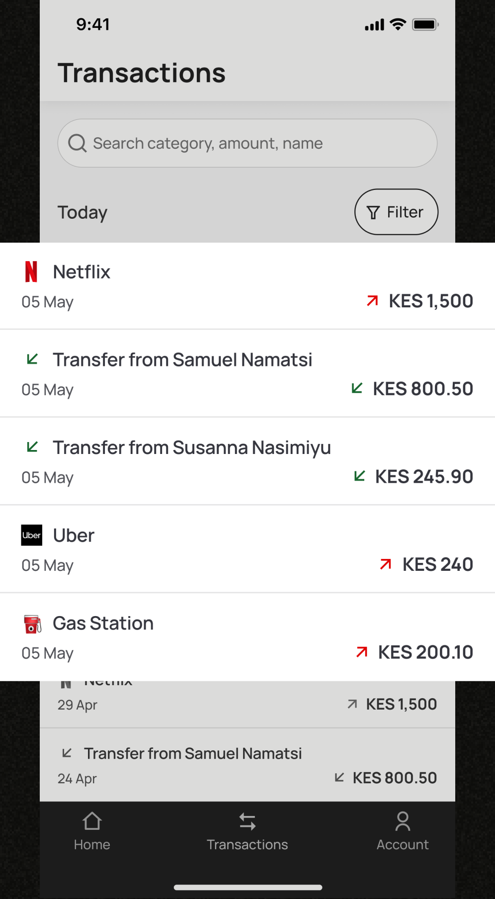
The simply seamless search.
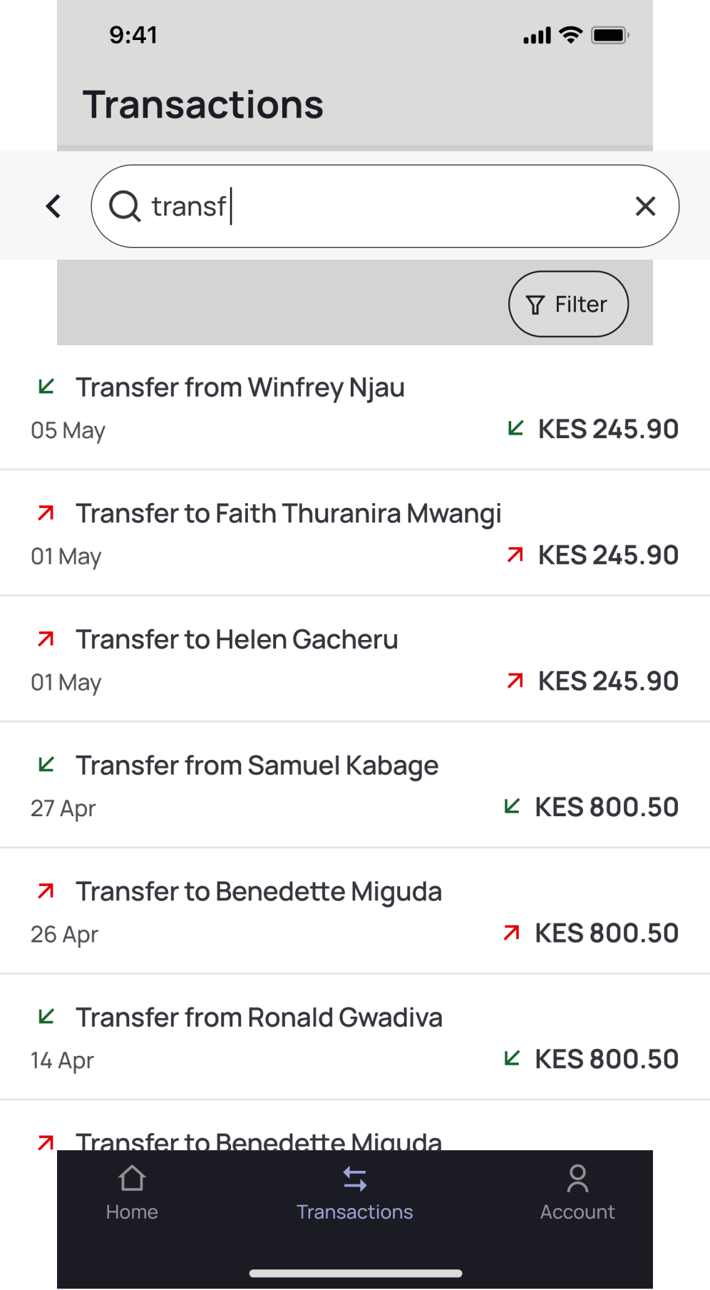
I designed a simple yet highly functional search and filter feature to ensure a seamless experience when locating specific transactions. This functionality is essential to address one of the primary use cases of the application—enabling users to track the movement of money in and out of their mobile money account.
Usability test & iterations.
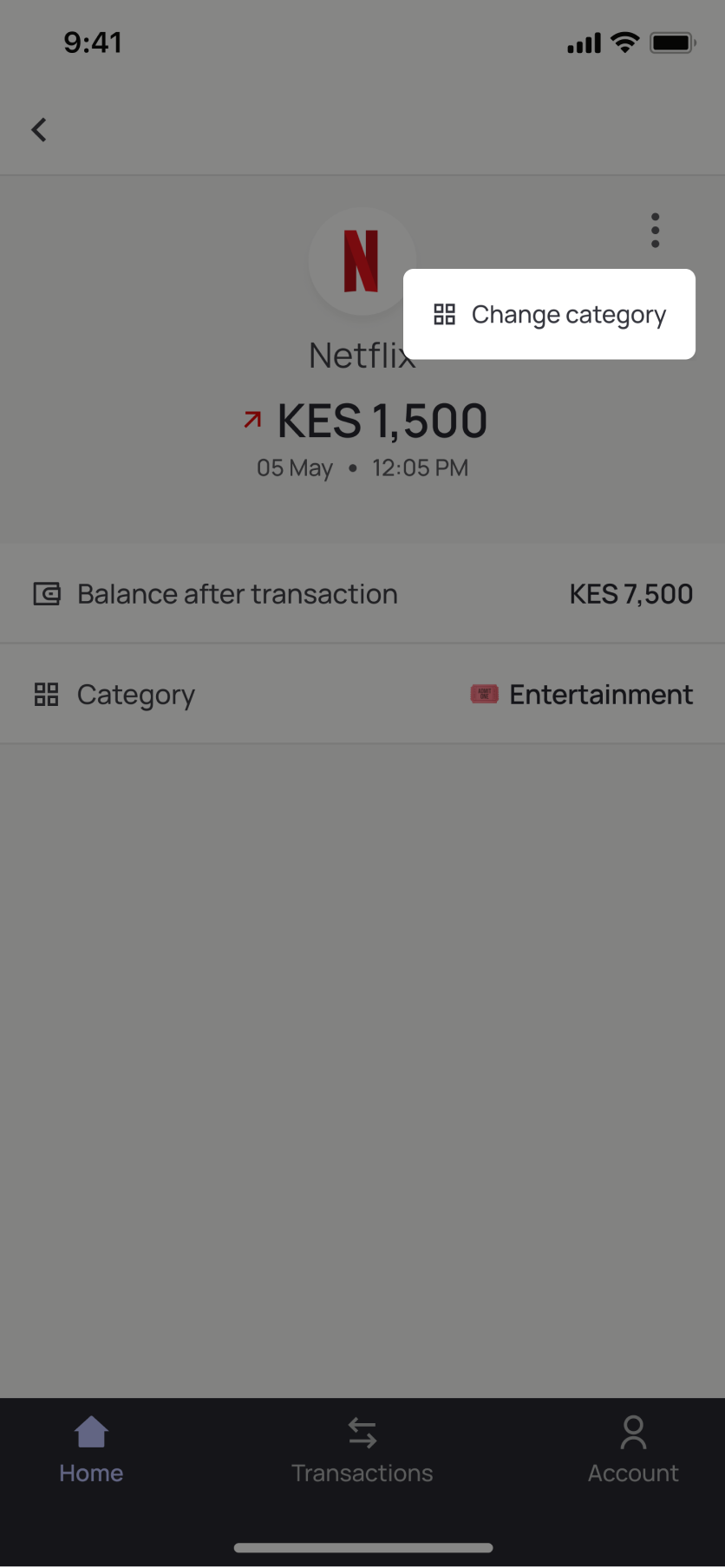
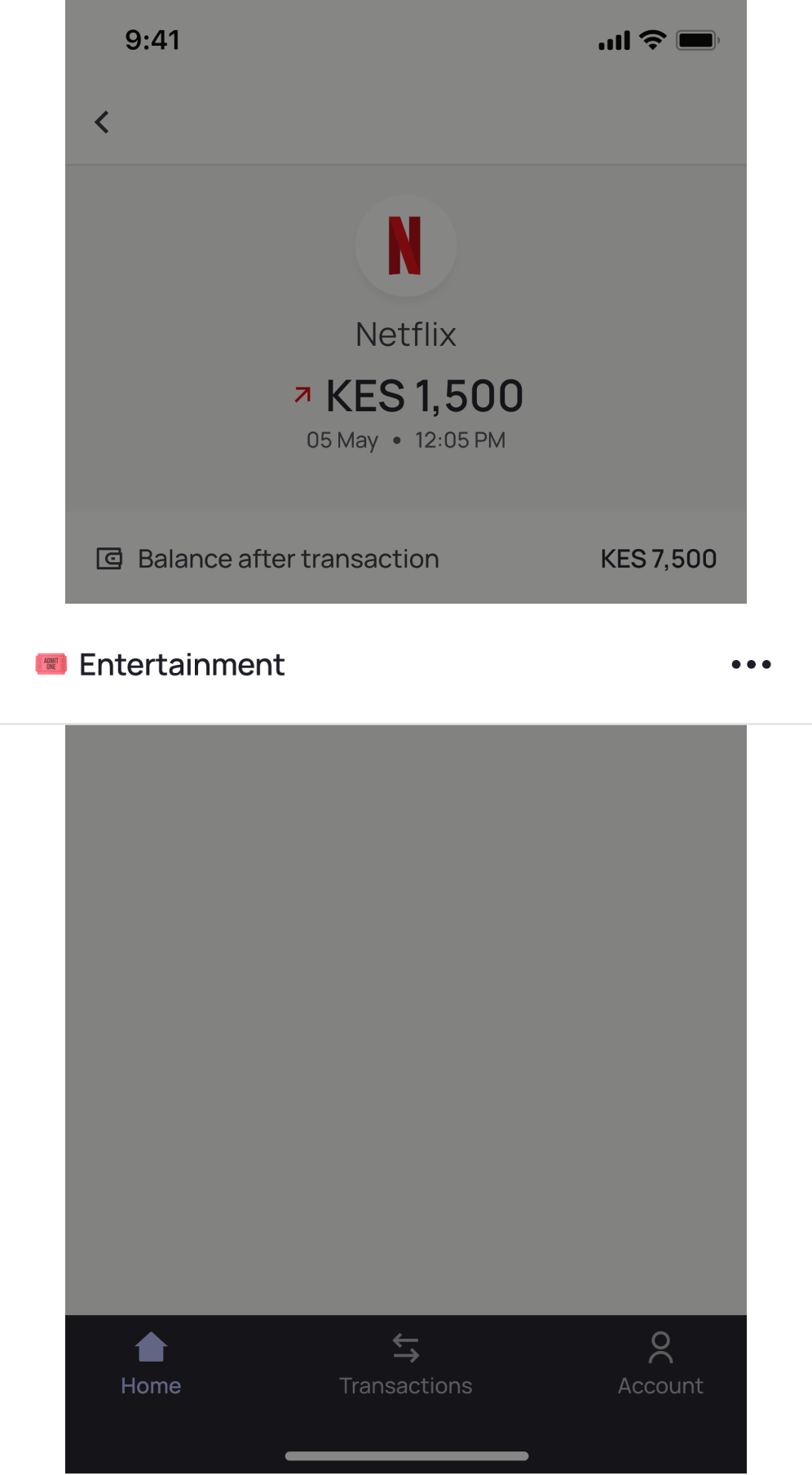
Following the completion of several tasks and the participants' responses to various questions, one major issue participants encountered was in their attempt to change the category of a transaction. Upon analysis, I deduced that the positioning of the action button did not obey the principle of "law of locality."
To address this issue, I made a revision in which I relocated the ‘more’ button to the category row, offering a more intuitive experience.
Constraints.
Technical constraint:
Our initial plan was to incorporate a third-party service into the Kontrol app. This service would enable users to link both their traditional bank accounts and mobile money accounts. However, we encountered some limitations that prompted us to reconsider.
The service operates in a rather unreliable manner and their approach is problematic for several reasons. Firstly, it is prone to glitches and instability. Secondly, it incurs high costs. Lastly, it poses a significant security risk since they need to store your credentials.
Time constraint:
We had planned to include a ‘savings’ and ‘budgeting’ feature in the app. However, due to technical requirements, these features will take longer to develop. As a result, we made the decision to launch with a usable and beneficial Minimum Viable Product (MVP) first. Moving forward, we will work on implementing the additional features.
Next steps.
We are currently working on this app as a side project. While the development process is taking longer than expected due to our commitments to our 9-5 jobs, we remain dedicated to its completion. Our plan is to:
- Launch an MVP as soon as possible and get feedback from early users.
- Iterate and continue to implement useful features based on user feedback.
