Research objectives
We kicked off the project by setting our research objectives:
- Uncover Usability Challenges: Understand the difficulties and obstacles users face when interacting with the app, particularly those leading to user drop-off during critical tasks
- Analyze User Engagement: Investigate the reasons behind user disengagement and identify the stages in the user journey where users are most likely to abandon the app.
- Examine Task Completion: Determine the factors that hinder successful task completion and explore ways to streamline the user journey for better efficiency and satisfaction.
Research methodologies
A dual-method approach was employed for a comprehensive study:
- Qualitative Insights: Focus groups were conducted to deep dive into the nuances of the app’s design, features, and overall functionality.
- Quantitative Analysis : Unmoderated usability tests provided objective data on task completion rates and user interaction patterns.
Usability tests takeaways
The scope of work required us to test certain user flows and recommend solutions to improve the usability of the mobile application. The key takeaways and design recommendations from the usability tests include:
- Payment Flow for Airtime and Data Purchases: The lengthy nature of these flows resulted in user drop-off.
- Overwhelming Offer Screens: Numerous offer screens cluttered the experience, overshadowing the primary Call-to-Actions (CTAs).
- App Accessibility - Visual: Users with visual impairments struggled to navigate and interact with the app due to insufficient contrast, small text sizes, and complex layouts.
- Visual Hierarchy: The current design lacks a clear visual hierarchy, leading to user confusion about which elements are most important, particularly in distinguishing between primary and secondary actions.
Improvements - Purchase airtime
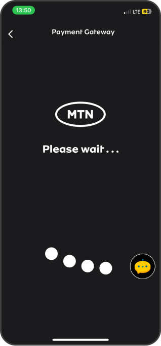
- Slow loading times: Slow loading times when users are redirected to an external payment gateway can significantly impact the user experience and result in drop-offs before completing the airtime top-up task, causing frustration and impatience.
- In-app Payment Integration: Instead of redirecting users to their bank app, integrate payment gateways directly into the MTN app. This could be done through APIs provided by banks or payment service providers that allow for secure transactions within the app.
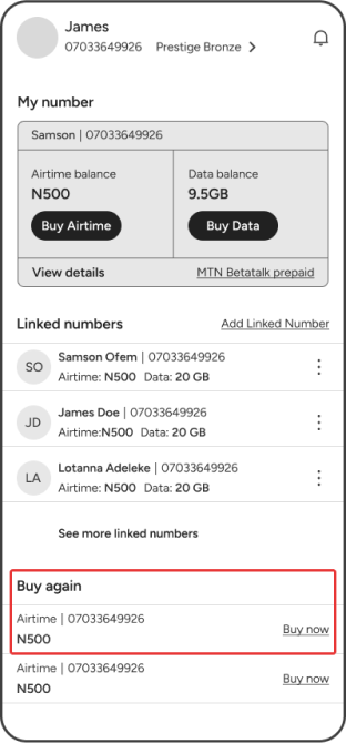
- One-click Purchase: Implement a one-click purchase option for users who have saved their payment information. After selecting the desired amount of airtime, users could simply tap a “Buy Now” button to complete the transaction.
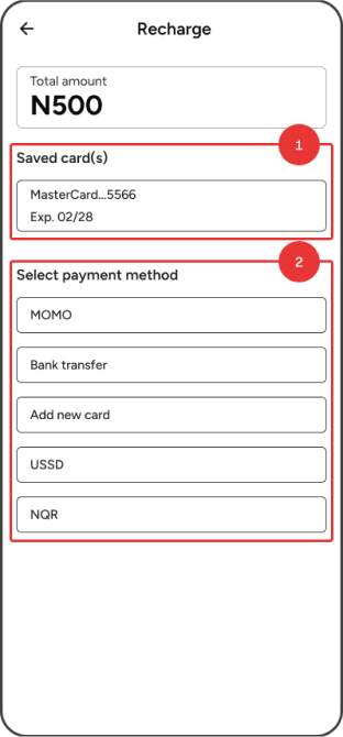
- Saved Payment Methods: Allow users to save their payment information, such as credit/debit card details or bank account information, securely within the app. This facilitates quicker purchases in the future as users can skip entering their payment details each time.
Old UI
Old UI
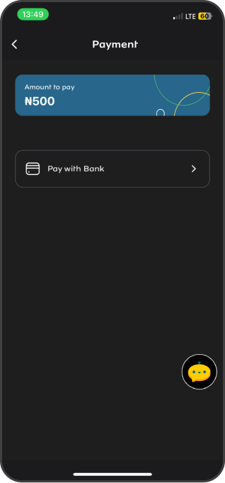
No option to select payment methods until payment gateway loads.
Old UI
Slow loading times when users are redirected to an external payment gateway.
Old UI
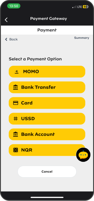
Payment gateway UI
Proposed UI
Proposed UI
- Saved payment methods allow for quicker purchases in the future as users can skip entering their payment details each time.
- Integrating payment gateways directly into the MTN app will cut the amount of time it takes to complete the airtime top-up task.
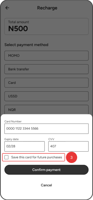
- Option to save cards for future purchases
Proposed UI
Implement a one-click purchase option for users to quickly top-up their airtime.
Improvements - Purchase data
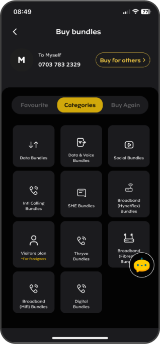
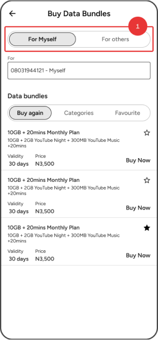
- Consistency: “Buy for other” button seems to be a secondary action and should be styled differently from “Buy Now” to avoid confusion.
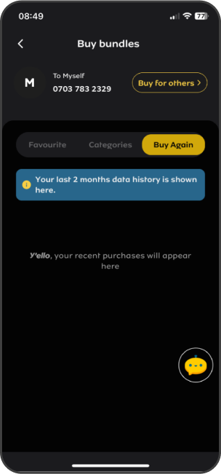
- Favourites Contextual Placement: In some cases, it makes sense to place a “Favourites” button or icon directly in the context of the content. In this case, next or near the title or header in a content app.
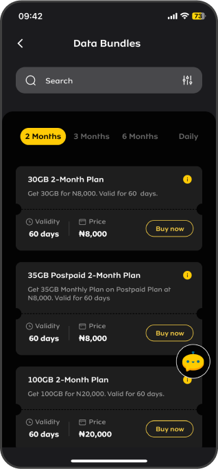
- Visual Hierarchy and Spacing : The spacing between the “Buy Now” buttons and the bundle descriptions is a bit tight. Increasing the padding could improve readability and tap-ability.
Old UI
Old UI
Doesn’t allow users add a data bundle as favourite.
Old UI
The “To Myself” & “Buy for others” section at the top of the screen aren’t represented in an intuitive manner.
Old UI
Payment gateway UI
Proposed UI
Proposed UI
- Using segmented controls for the “For others” option clearly shows it's a choice you can select, not a button like “Buy now”.
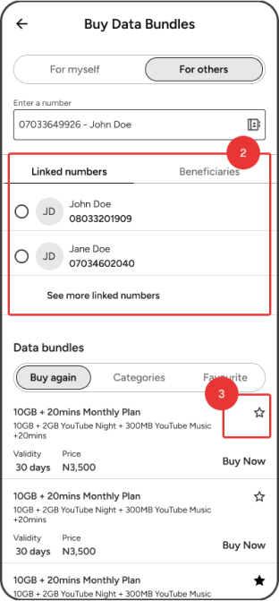
- “Buy for others” page shows linked numbers and beneficiaries for quick selection and ultimately a shorter process to purchase data.
- A star icon that represents favouriting a data plan is placed in context of the content.
Improvements - Borrow airtime
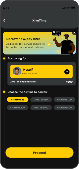
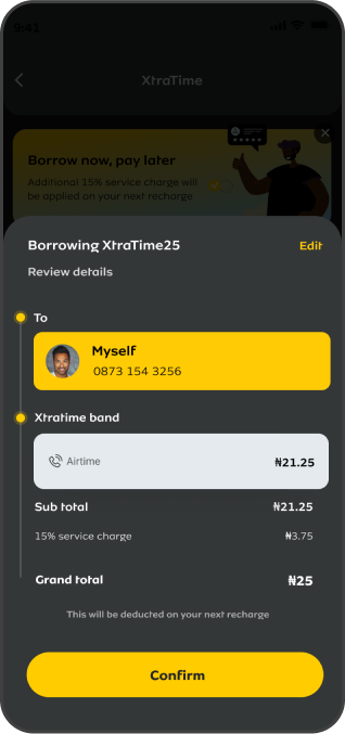
- Visual Hierarchy: There's a need for a better visual hierarchy to lead the user's eye through the information sequentially, from the recipient to the service selected, the cost breakdown, and finally the total.
- Design Simplicity: The “Myself & Airtime cards” take up most of the attention, which might be unnecessary at this confirmation stage and could be hidden to reduce cognitive load.
- User Control: Provide users with clear options to go back or edit their choices before finalizing the transaction to enhance the sense of control. Providing a clear “Edit” or “Cancel” option would empower the us.
Old UI
Proposed UI
Proposed UI
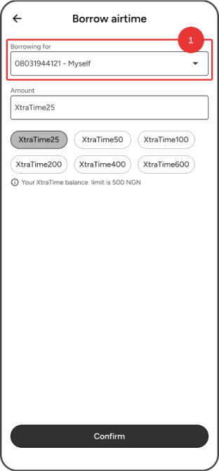
- Removing the promotional banner as seen on the old UI, and making the “borrowing for” section simpler helps clear up the screen and keeps the user's attention on what they're doing.
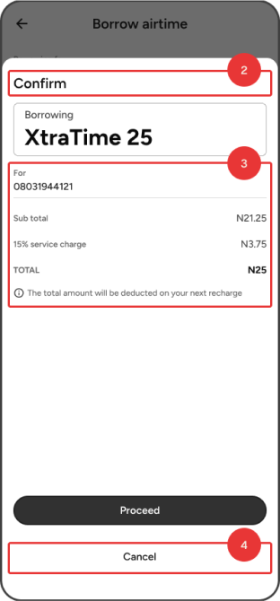
- Display the title to explain the purpose of the screen.
- Arrange the information in a way that guides the viewer's attention from one piece of information to the next, in order.
- Give users a “cancel” button so they can change their choices before they finish the transaction, making them feel more in control.
Improvements - Linking account
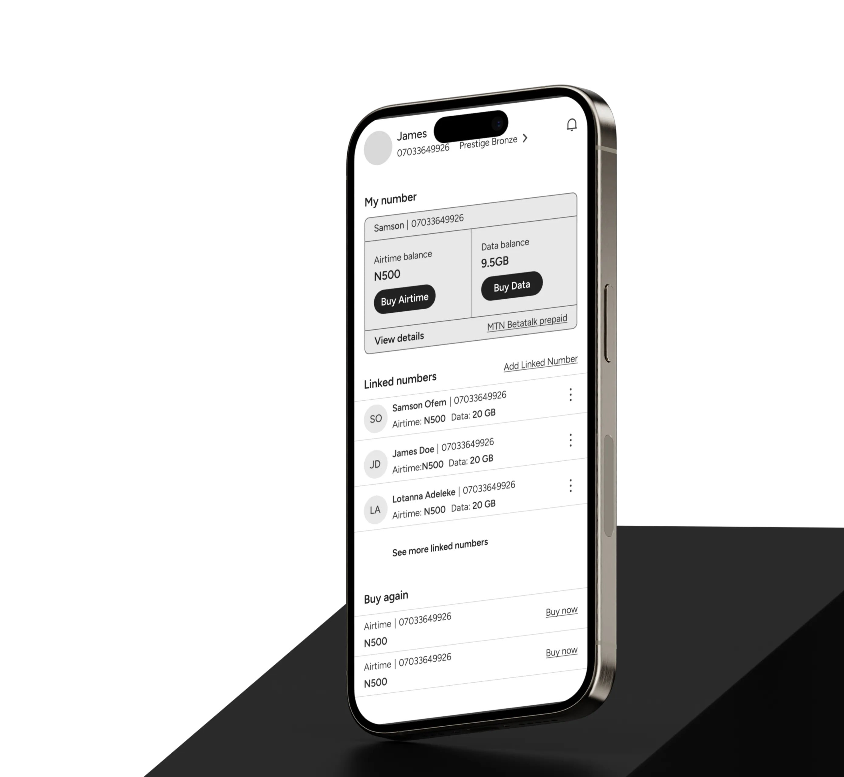
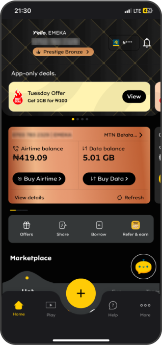
- Increase the Visibility/Discoverability of the Feature: Key features like account linking should be easily discoverable.
Old UI
Proposed UI
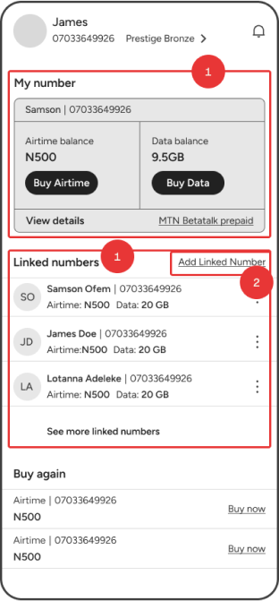
Proposed UI
- This layout helps you navigate easily because it groups related items together. For example, the “My Number” section contains all the details about your number, and the “Linked Numbers” section keeps track of numbers connected to yours. The “Linked Numbers” section also allows us introduce the link account feature to the forefront of the interface.
- Place the “Add linked number” button near the area it affects, to keep things local and intuitive
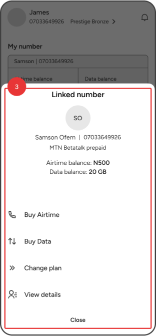
- Hide other actions in a “more” bottom panel. This method is widely embraced across both web and mobile platform designs, catering to the user's pre-existing familiarity with such navigational patterns. It serves to streamline the user experience by decluttering the primary view, thereby enhancing usability and maintaining focus on the core functionalities.
Next steps.
We delivered a full report to MTN Nigeria and walked their team of designers, developers, and other stakeholders through the entire report and our proposed UI and UX recommendations. The MTN team is now implementing these changes to align the app's functionalities with user expectations and enhance overall customer satisfaction.
