Design process
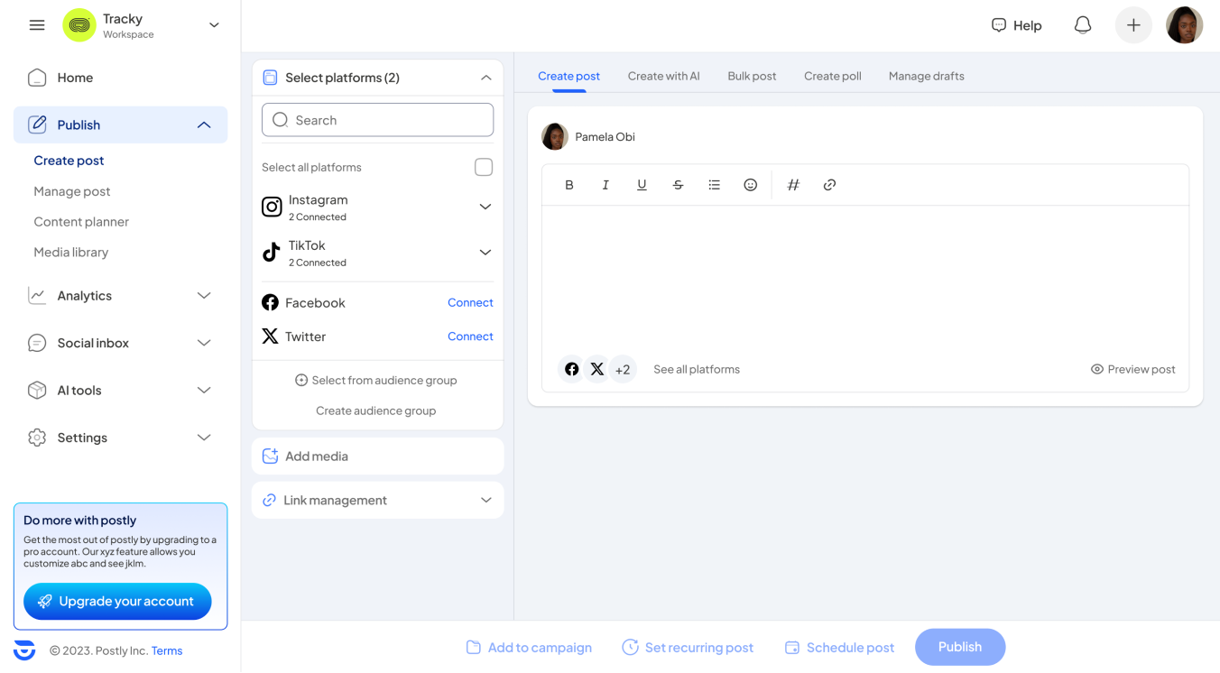
The design process for the Postly dashboard revamp was meticulously structured to ensure that every change was informed by a deep understanding of the product and its users. This involved an initial comprehensive review followed by an iterative design cycle in close collaboration with the Postly team.
- Initial Research and Familiarization
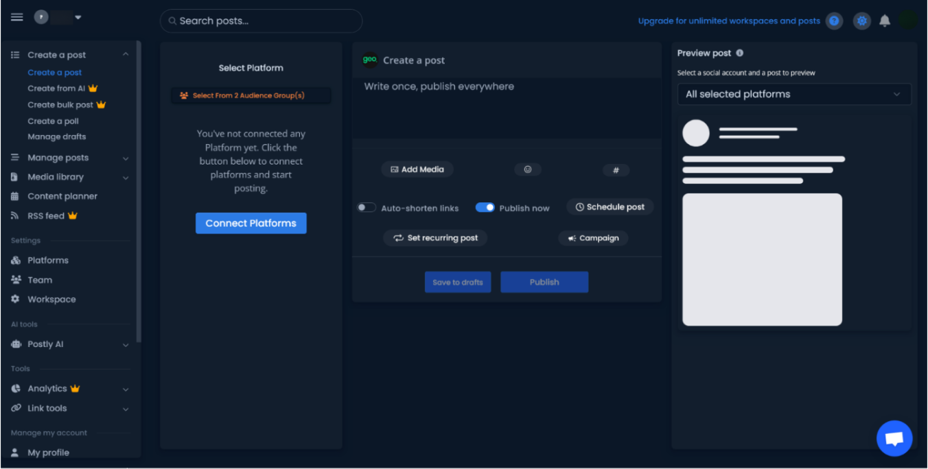
- Product Documentation and UI Exploration: Initially, I was provided with extensive documentation of the product's features and granted full access to the existing dashboard. This phase was crucial for gaining a deep insight into how Postly functions and the pain points users may encounter. Familiarizing myself with the user interface allowed me to assess the current user experience firsthand, identifying areas for enhancement.
- Information Structuring
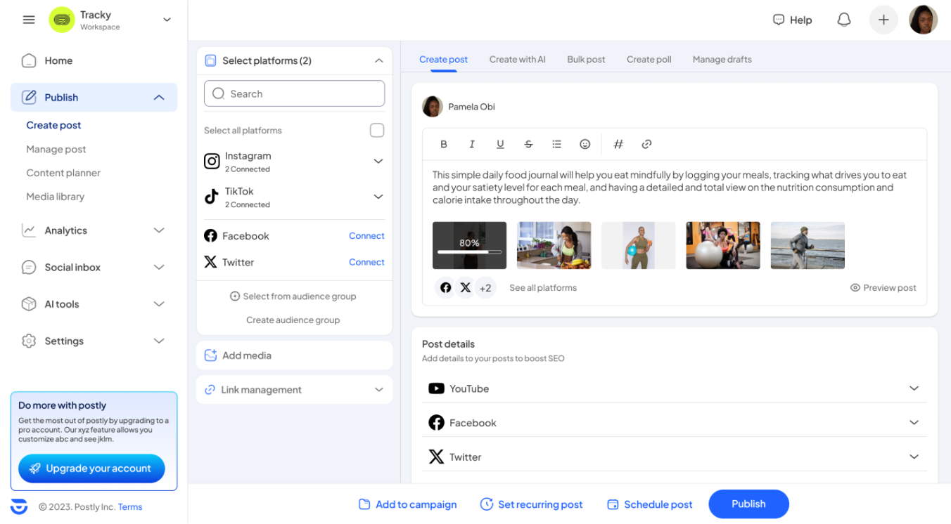
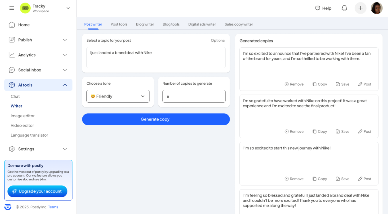
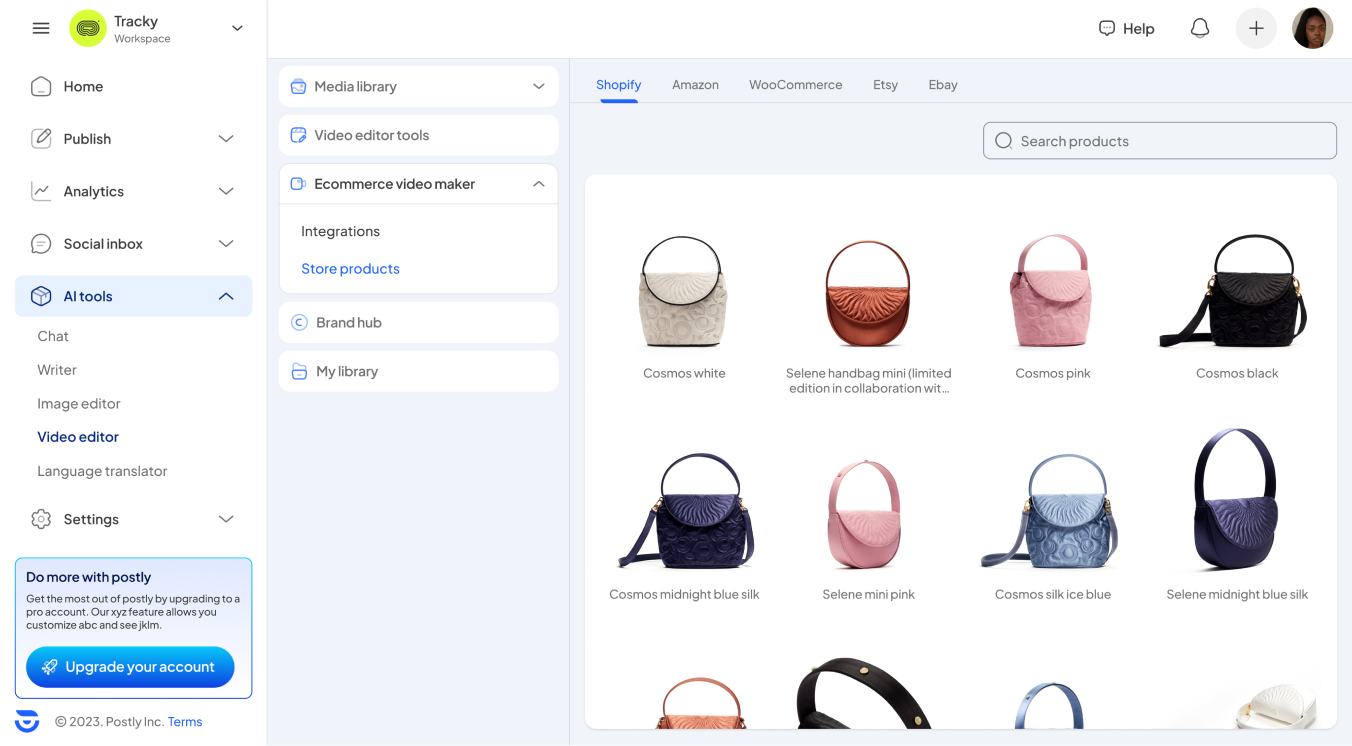
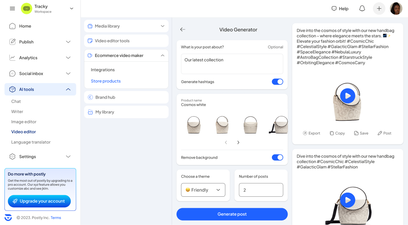
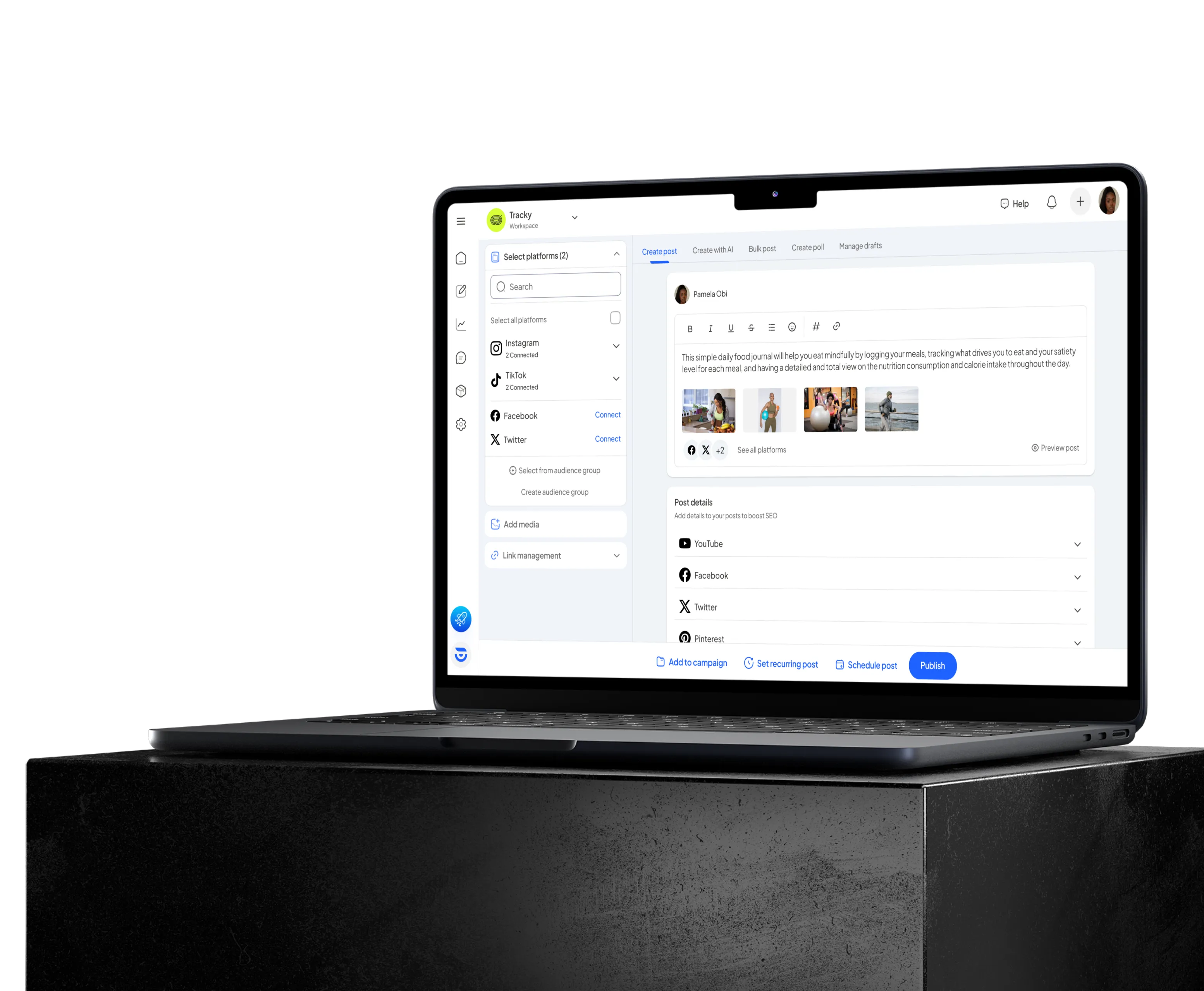
- Rationalizing the Information Architecture: Building on the insights gained, I restructured the information architecture to enhance clarity and flow. By logically grouping related features and employing the law of locality, I crafted a user interface that prioritized intuitiveness and ease of navigation. This approach ensured that users could find the necessary tools quickly and understand the relationships between different data points effortlessly.
- Collaborative Design Iteration
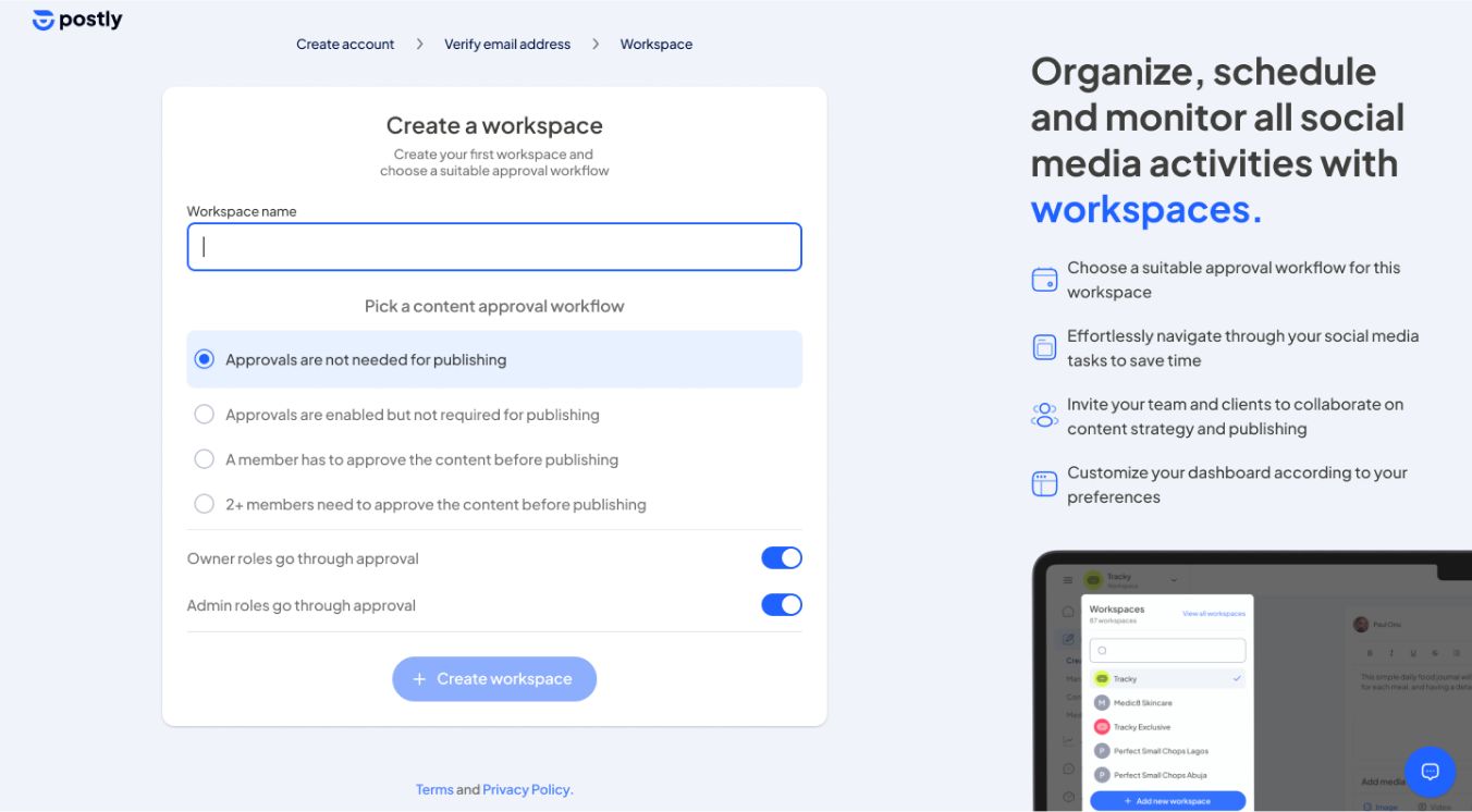
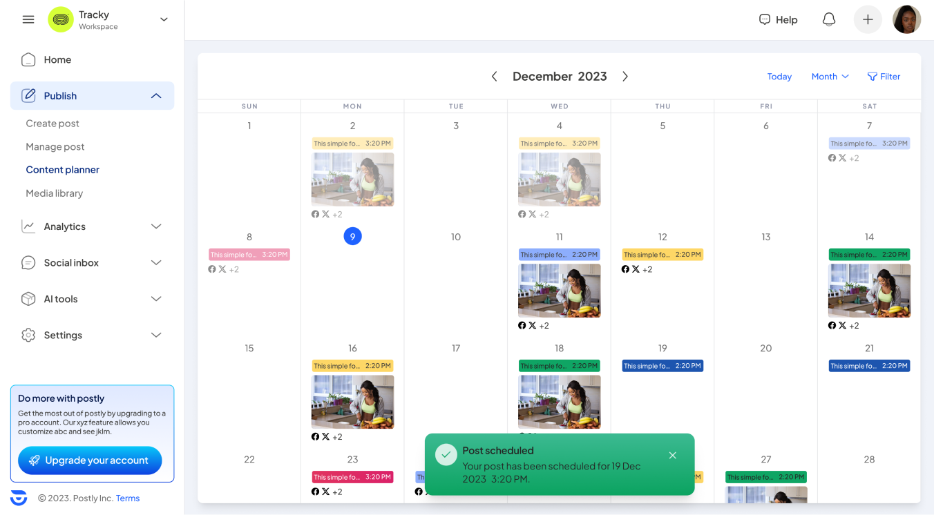
- Feedback Loops and Iterative Design: Throughout the design process, I maintained an ongoing dialogue with the Postly team. After presenting initial design concepts, I gathered feedback which was pivotal in refining the designs. Each iteration brought us closer to a dashboard that not only met the current needs of users but also incorporated the flexibility to accommodate future expansions, aligning with Postly's strategic plans.
- Design for Scalability
- Incorporating Future Growth: Understanding Postly's future aspirations was integral to the design process. The team shared insights into upcoming features and expansions, allowing me to ensure that the new dashboard design could scale seamlessly with these developments. This foresight was incorporated through adaptable UI components and scalable navigation schemes.
This structured, iterative approach not only facilitated a design that was well-aligned with user needs and business goals but also enhanced my skills in creating adaptable, future-proof digital environments. Collaborating closely with the Postly team enriched the project with diverse perspectives, making the final product not just usable but also a robust foundation for future enhancements.
The design process employed for the Postly dashboard was a blend of strategic planning, user-centric design principles, and collaborative feedback loops. This approach ensured the creation of a product that is intuitive, scalable, and poised for future growth.
